

前端的布局中,左右布局是一种很常见布局方式,下面是我在前端工作中的几种方法:
1、float实现左右布局
左右布局实现的一个有效方法是利用css中的float属性,代码如下:
//html
 <div class="box">
   <div class="left-box"></div>
   <div class="right-box"></div>
</div>

//css
.box{
  width: 400px;
  height: 300px;
  background: darkgray;
}
.left-box,.right-box{
  width: 50%;
  height: 100%;
  float: left;//设置两个盒子float:left
}
.left-box{
  background: red;
}
.right-box{
  background: green;
}
我们很容易就得到了一个左右布局:
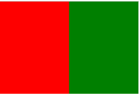
但这种方法也并非完美,需要注意浮动所导致的父元素高度塌陷的问题,这就涉及要清除浮动的问题了,清除浮动的方法也有很多,我比较推荐用伪元素清除的方法。这个会单独介绍。
2、 display: inline-block实现左右布局
这种方法是把子元素变为行内块元素,从而实现元素的左右排列。
//html
 <div class="box">
    <div class="left-box"></div>
    <div class="right-box"></div>
</div>

//css
.box{
  width: 300px;
  height: 200px;
  background: darkgray;
}
.left-box,.right-box{
  width: 50%;
  height: 100%;
 display: inline-block;//子元素变为行内块
}
.left-box{
  background: red;
}
.right-box{
  background: green;
}
但是如果直接这样写,我们运行后会发现并不能实现左右居中,右边的盒子会直接掉下去,情况如下:
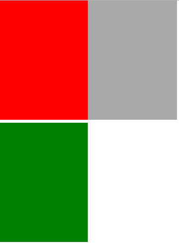
这是因为block的元素inline-block化后,IE6/7没有换行符间隙问题,其他浏览器均有;inline的元素inline-block后,所有主流浏览器都有换行符/空格间隙问题; 即两个inline-blockb元素中间会有空隙。造成原本在一列的元素变成两列, 解决这种问题,只需在父元素添加font-size:0;即可解决:
.box{
  width: 300px;
  height: 200px;
  background: darkgray;
  font-size: 0;//设置字体大小为0
}
.left-box,.right-box{
  width: 50%;
  height: 100%;
 display: inline-block;
}
.left-box{
  background: red;
}
.right-box{
  background: green;
}
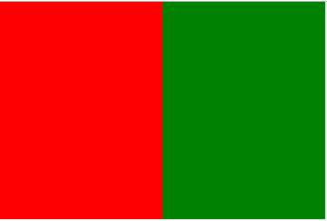
3、 绝对定位实现左右布局
绝对定位也是一种解决左右布局的好方法,在父元素设置相对定位,子元素设置绝对定位:
//html
 <div class="box">
    <div class="left-box"></div>
    <div class="right-box"></div>
</div>

//css
.box{
  width: 300px;
  height: 200px;
  background: darkgray;
  position: relative;//父元素设置相对定位
}
.left-box,.right-box{
  position: absolute;//子元素绝对定位
  width: 50%;
  height: 100%;
}
.left-box{
  background: red;
}
.right-box{
  left: 50%;//设置left为左边盒子的宽度
  background: green;
}
这种实现的效果和上边一样,不再附图。
另外也有用table、float+margin实现的,table这种在早期开发中比较常见,在现在开发中基本销声匿迹,float+margin等实现起来比较麻烦,故不介绍。
