

前言
只有你想不到,没有 css 做不到。今日分享只由 css 实现的效果 - weather
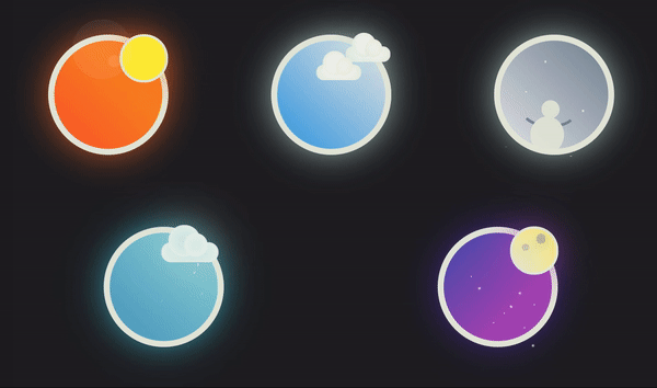
效果
源码
以下是为效果图的所有实现源码,因为 css 内容较长,相关 css 可以点击查看展开阅读。
或者
点击访问 这里 查看源码,并附有 codepen 在线编辑为您带来不一样的体验。可以点个 star 再回来。
Sunny
<!-- html -->
<div class="weather">
    <div class="sunny">
        <span class="sun"></span>
    </div>
</div>
点击查看 sunny css源码
.weather {
  width: 100%;
  font-size: -webkit-calc(1em);
  font-size: calc(1em);
  display: -webkit-box;
  display: -webkit-flex;
  display: -ms-flexbox;
  display: flex;
  -webkit-box-align: center;
  -webkit-align-items: center;
      -ms-flex-align: center;
          align-items: center;
  -webkit-justify-content: space-around;
      -ms-flex-pack: distribute;
          justify-content: space-around;
  -webkit-flex-flow: row wrap;
      -ms-flex-flow: row wrap;
          flex-flow: row wrap;
  font-family: 'Work Sans', sans-serif;
  background: #212125;
  color: #e6e8db;
}
.sunny {
  -webkit-box-flex: 0;
  -webkit-flex: none;
      -ms-flex: none;
          flex: none;
  display: block;
  position: relative;
  font-size: -webkit-calc(11em);
  font-size: calc(11em);
  width: 1em;
  height: 1em;
  margin: .3em;
  border-radius: 100%;
  -webkit-box-shadow: 0 0 0 0.05em currentColor inset, 0 0 0.3em -0.03em #fd6f21;
          box-shadow: 0 0 0 0.05em currentColor inset, 0 0 0.3em -0.03em #fd6f21;
  background: -webkit-linear-gradient(top right, #fc5830 0%, #f98c24 65%);
  background: linear-gradient(to top right, #fc5830 0%, #f98c24 65%);
}
.sun {
  position: absolute;
  top: 20%;
  left: 80%;
  -webkit-transform: translate(-50%, -50%);
      -ms-transform: translate(-50%, -50%);
          transform: translate(-50%, -50%);
  width: 40%;
  height: 40%;
  border-radius: 100%;
  background: #ffeb3b;
  -webkit-box-shadow: 0 0 0 0.02em currentColor inset, 0 0 0.3em -0.03em #fd6f21;
          box-shadow: 0 0 0 0.02em currentColor inset, 0 0 0.3em -0.03em #fd6f21;
  -webkit-transform-origin: .1em .1em;
      -ms-transform-origin: .1em .1em;
          transform-origin: .1em .1em;
}
.sun::after {
  content: '';
  position: absolute;
  top: .1em;
  left: 0;
  will-change: transform;
  -webkit-transform: translate(-50%, -50%);
      -ms-transform: translate(-50%, -50%);
          transform: translate(-50%, -50%);
  width: .1em;
  height: .1em;
  border-radius: 100%;
  background: rgba(255, 255, 255, 0.1);
  -webkit-box-shadow: 0 0 0.1em 0 rgba(255, 255, 255, 0.3) inset, -0.1em -0.1em 0 0.2em rgba(255, 255, 255, 0.1);
          box-shadow: 0 0 0.1em 0 rgba(255, 255, 255, 0.3) inset, -0.1em -0.1em 0 0.2em rgba(255, 255, 255, 0.1);
  -webkit-animation: flare 12000ms infinite alternate linear;
          animation: flare 12000ms infinite alternate linear;
}
@-webkit-keyframes flare {
  to {
    -webkit-transform: translate(-0.3em, 0.3em);
            transform: translate(-0.3em, 0.3em);
    opacity: .4;
    font-size: .2em;
  }
}
@keyframes flare {
  to {
    -webkit-transform: translate(-0.3em, 0.3em);
            transform: translate(-0.3em, 0.3em);
    opacity: .4;
    font-size: .2em;
  }
}
Cloudy
<!-- html -->
<div class="weather">
    <div class="cloudy">
        <span class="cloud"></span>
        <span class="cloud"></span>
    </div>
</div>
点击查看 cloudy css源码
.weather {
  width: 100%;
  font-size: -webkit-calc(1em);
  font-size: calc(1em);
  display: -webkit-box;
  display: -webkit-flex;
  display: -ms-flexbox;
  display: flex;
  -webkit-box-align: center;
  -webkit-align-items: center;
      -ms-flex-align: center;
          align-items: center;
  -webkit-justify-content: space-around;
      -ms-flex-pack: distribute;
          justify-content: space-around;
  -webkit-flex-flow: row wrap;
      -ms-flex-flow: row wrap;
          flex-flow: row wrap;
  font-family: 'Work Sans', sans-serif;
  background: #212125;
  color: #e6e8db;
}
.cloudy {
  -webkit-box-flex: 0;
  -webkit-flex: none;
      -ms-flex: none;
          flex: none;
  display: block;
  position: relative;
  font-size: -webkit-calc(11em);
  font-size: calc(11em);
  width: 1em;
  height: 1em;
  margin: .3em;
  border-radius: 100%;
  -webkit-box-shadow: 0 0 0 0.05em currentColor inset, 0 0 0.3em -0.03em #c9e8de;
          box-shadow: 0 0 0 0.05em currentColor inset, 0 0 0.3em -0.03em #c9e8de;
  background: -webkit-gradient(linear, from(#1b9ce2), to(#e0e2e5));
  background: -webkit-linear-gradient(top right, #1b9ce2 0%, #e0e2e5 90%);
  background: linear-gradient(to top right, #1b9ce2 0%, #e0e2e5 90%);
}
.cloud {
  position: absolute;
  top: .1em;
  left: 65%;
  width: .37em;
  height: .13em;
  border-radius: .1em;
  background-color: #fff;
  -webkit-box-shadow: 0 0 0.1em 0.02em #f0f2f0 inset, 0 0 0.3em -0.03em #c9e8de;
          box-shadow: 0 0 0.1em 0.02em #f0f2f0 inset, 0 0 0.3em -0.03em #c9e8de;
  -webkit-animation: move 3000ms infinite ease-in-out;
          animation: move 3000ms infinite ease-in-out;
}
.cloud + .cloud {
  top: 25%;
  left: 40%;
  -webkit-animation: move 3700ms infinite linear;
          animation: move 3700ms infinite linear;
}
.cloud::before,
.cloud::after {
  content: '';
  position: inherit;
  border-radius: inherit;
  background-color: inherit;
  -webkit-box-shadow: inherit;
          box-shadow: inherit;
  bottom: 30%;
}
.cloud::before {
  left: .05em;
  width: .2em;
  height: .2em;
}
.cloud::after {
  left: .15em;
  width: .15em;
  height: .15em;
}
@-webkit-keyframes move {
  50% {
    -webkit-transform: translateX(-0.05em);
            transform: translateX(-0.05em);
  }
}
@keyframes move {
  50% {
    -webkit-transform: translateX(-0.05em);
            transform: translateX(-0.05em);
  }
}
Snowy
<!-- html -->
<div class="weather">
    <div class="snowy">
        <span class="snowman"></span>
        <ul>
            <li></li>
            <li></li>
            <li></li>
            <li></li>
            <li></li>
            <li></li>
            <li></li>
            <li></li>
            <li></li>
            <li></li>
            <li></li>
            <li></li>
            <li></li>
        </ul>
    </div>
</div>
点击查看 snowy css源码
.weather {
  width: 100%;
  font-size: -webkit-calc(1em);
  font-size: calc(1em);
  display: -webkit-box;
  display: -webkit-flex;
  display: -ms-flexbox;
  display: flex;
  -webkit-box-align: center;
  -webkit-align-items: center;
      -ms-flex-align: center;
          align-items: center;
  -webkit-justify-content: space-around;
      -ms-flex-pack: distribute;
          justify-content: space-around;
  -webkit-flex-flow: row wrap;
      -ms-flex-flow: row wrap;
          flex-flow: row wrap;
  font-family: 'Work Sans', sans-serif;
  background: #212125;
  color: #e6e8db;
}
.snowy {
  -webkit-box-flex: 0;
  -webkit-flex: none;
      -ms-flex: none;
          flex: none;
  display: block;
  position: relative;
  font-size: -webkit-calc(11em);
  font-size: calc(11em);
  width: 1em;
  height: 1em;
  margin: .3em;
  border-radius: 100%;
  -webkit-box-shadow: 0 0 0 0.05em currentColor inset, 0 0 0.3em -0.03em #c9e8de;
          box-shadow: 0 0 0 0.05em currentColor inset, 0 0 0.3em -0.03em #c9e8de;
  background: -webkit-gradient(linear, from(#758595), to(#e0e2e5));
  background: -webkit-linear-gradient(bottom left, #758595 0%, #e0e2e5 90%);
  background: linear-gradient(to bottom left, #758595 0%, #e0e2e5 90%);
}
.snowy ul {
  position: absolute;
  list-style: none;
  top: 0%;
  left: 10%;
  right: 0%;
  height: 100%;
  margin: 0;
  padding: 0;
}
.snowy li::before,
.snowy li::after {
  content: '';
  position: absolute;
  list-style: none;
  width: .015em;
  height: .01em;
  border-radius: 100%;
  background-color: currentColor;
  will-change: transform, opacity;
  -webkit-animation: snow 3700ms infinite ease-out;
          animation: snow 3700ms infinite ease-out;
  opacity: 0;
}
.snowy li:nth-child(2n+1)::before,
.snowy li:nth-child(13n+11)::after {
  top: -7%;
  left: 40%;
}
.snowy li:nth-child(3n+2)::before,
.snowy li:nth-child(11n+7)::after {
  top: 5%;
  left: 90%;
  -webkit-animation-delay: 1000ms;
          animation-delay: 1000ms;
}
.snowy li:nth-child(5n+3)::before,
.snowy li:nth-child(7n+5)::after {
  top: -10%;
  left: 80%;
  -webkit-animation-delay: 2000ms;
          animation-delay: 2000ms;
}
.snowy li:nth-child(7n+5)::before,
.snowy li:nth-child(5n+3)::after {
  top: 10%;
  left: 10%;
  -webkit-animation-delay: 1300ms;
          animation-delay: 1300ms;
}
.snowy li:nth-child(11n+7)::before,
.snowy li:nth-child(3n+2)::after {
  top: 20%;
  left: 70%;
  -webkit-animation-delay: 1500ms;
          animation-delay: 1500ms;
}
.snowy li:nth-child(13n+11)::before,
.snowy li:nth-child(2n+1)::after {
  top: 35%;
  left: 20%;
  -webkit-animation-delay: 500ms;
          animation-delay: 500ms;
}
.snowman {
  position: absolute;
  bottom: 30%;
  left: 40%;
  width: .15em;
  height: .15em;
  opacity: .9;
  background: currentColor;
  border-radius: 100%;
}
.snowman::after {
  content: '';
  position: absolute;
  top: 90%;
  left: 30%;
  -webkit-transform: translate(-50%, 0%);
      -ms-transform: translate(-50%, 0%);
          transform: translate(-50%, 0%);
  width: .275em;
  height: .3em;
  border-radius: inherit;
  background-color: currentColor;
}
.snowman::before {
  content: '';
  position: absolute;
  top: 0%;
  left: 50%;
  -webkit-transform: translate(-55%, -50%);
      -ms-transform: translate(-55%, -50%);
          transform: translate(-55%, -50%);
  width: .45em;
  height: .4em;
  border-radius: 60%;
  border: .02em solid transparent;
  border-bottom-color: #758595;
  will-change: border-radius;
  -webkit-animation: snowman 9000ms infinite ease-in;
          animation: snowman 9000ms infinite ease-in;
}
@-webkit-keyframes snow {
  50% {
    opacity: 1;
  }
  100% {
    -webkit-transform: translate(-0.1em, 15vmin);
            transform: translate(-0.1em, 15vmin);
  }
}
@keyframes snow {
  50% {
    opacity: 1;
  }
  100% {
    -webkit-transform: translate(-0.1em, 15vmin);
            transform: translate(-0.1em, 15vmin);
  }
}
@-webkit-keyframes snowman {
  50% {
    border-radius: 60% 60% 30% 50%;
  }
}
@keyframes snowman {
  50% {
    border-radius: 60% 60% 30% 50%;
  }
}
Stormy
<!-- html -->
<div class="weather">
    <div class="stormy">
        <span class="cloud"></span>
        <ul>
            <li></li>
            <li></li>
            <li></li>
            <li></li>
            <li></li>
        </ul>
    </div>
</div>
点击查看 stormy css源码
.weather {
  width: 100%;
  font-size: -webkit-calc(1em);
  font-size: calc(1em);
  display: -webkit-box;
  display: -webkit-flex;
  display: -ms-flexbox;
  display: flex;
  -webkit-box-align: center;
  -webkit-align-items: center;
      -ms-flex-align: center;
          align-items: center;
  -webkit-justify-content: space-around;
      -ms-flex-pack: distribute;
          justify-content: space-around;
  -webkit-flex-flow: row wrap;
      -ms-flex-flow: row wrap;
          flex-flow: row wrap;
  font-family: 'Work Sans', sans-serif;
  background: #212125;
  color: #e6e8db;
}
.stormy {
  -webkit-box-flex: 0;
  -webkit-flex: block;
      -ms-flex: block;
          flex: block;
  display: block;
  position: relative;
  font-size: -webkit-calc(11em);
  font-size: calc(11em);
  width: 1em;
  height: 1em;
  margin: .3em;
  border-radius: 100%;
  -webkit-box-shadow: 0 0 0 0.05em currentColor inset, 0 0 0.3em -0.03em #34c6d8;
          box-shadow: 0 0 0 0.05em currentColor inset, 0 0 0.3em -0.03em #34c6d8;
  background: -webkit-gradient(linear, from(#4b9cc2), to(#9adbd9));
  background: -webkit-linear-gradient(top right, #4b9cc2 0%, #9adbd9 100%);
  background: linear-gradient(to top right, #4b9cc2 0%, #9adbd9 100%);
}
.stormy::before {
  content: '';
  position: absolute;
  top: 0;
  left: 0;
  right: 0;
  bottom: 0;
  margin: .05em;
  border-radius: 100%;
  opacity: .4;
  will-change: background-color;
  -webkit-animation: flash 2300ms infinite linear 80ms;
          animation: flash 2300ms infinite linear 80ms;
}
.stormy .cloud {
  position: absolute;
  top: .1em;
  width: .37em;
  height: .13em;
  border-radius: .1em;
  background-color: #c9e8de;
  font-size: 1.3em;
  left: 50%;
  box-shadow: 0 0 .1em .02em #f0f2f0 inset,0 0 .3em -0.03em #c9e8de;
  will-change: background-color, transform, opacity;
  -webkit-animation: cloudflash 2300ms infinite linear, move 3700ms infinite linear;
          animation: cloudflash 2300ms infinite linear, move 3700ms infinite linear;
}
.cloud::before,
.cloud::after {
  content: '';
  position: inherit;
  border-radius: inherit;
  background-color: inherit;
  -webkit-box-shadow: inherit;
          box-shadow: inherit;
  bottom: 30%;
}
.cloud::before {
  left: .05em;
  width: .2em;
  height: .2em;
}
.cloud::after {
  left: .15em;
  width: .15em;
  height: .15em;
}
.stormy ul {
  position: absolute;
  list-style: none;
  top: 0%;
  left: 70%;
  right: 0%;
  height: 100%;
  margin: 0;
  padding: 0;
}
.stormy li,
.stormy li::before,
.stormy li::after {
  position: absolute;
  width: .005em;
  height: .02em;
  border-radius: 10%;
  background-color: #eee;
  opacity: 0;
  will-change: transform, opacity;
  -webkit-animation: rain 2000ms infinite linear;
          animation: rain 2000ms infinite linear;
  -webkit-transform: rotate(25deg);
      -ms-transform: rotate(25deg);
          transform: rotate(25deg);
}
.stormy li::before,
.stormy li::after {
  content: '';
}
.stormy li:nth-child(5n+3)::before,
.stormy li:nth-child(11n+7)::after,
.stormy li:nth-child(2n+1) {
  top: 10%;
  left: 68%;
  -webkit-animation-delay: 500ms;
          animation-delay: 500ms;
}
.stormy li:nth-child(3n+2)::after,
.stormy li:nth-child(7n+5)::after,
.stormy li:nth-child(3n+2) {
  top: 5%;
  left: 45%;
  -webkit-animation-delay: 1250ms;
          animation-delay: 1250ms;
}
.stormy li:nth-child(2n+1)::before,
.stormy li:nth-child(5n+3)::after,
.stormy li:nth-child(7n+5) {
  top: 4%;
  left: 82%;
  -webkit-animation-delay: 750ms;
          animation-delay: 750ms;
}
.stormy li:nth-child(11n+7)::before,
.stormy li:nth-child(3n+2)::after,
.stormy li:nth-child(7n+5) {
  top: 15%;
  left: 15%;
  -webkit-animation-delay: 2000ms;
          animation-delay: 2000ms;
}
.stormy li:nth-child(7n+5)::before,
.stormy li:nth-child(2n+1)::after,
.stormy li:nth-child(11n+7) {
  top: 10%;
  left: 33%;
  -webkit-animation-delay: 2500ms;
          animation-delay: 2500ms;
}
@-webkit-keyframes flash {
  49% {
    background-color: rgba(255, 255, 255, 0);
  }
  51% {
    background-color: currentColor;
  }
  53% {
    background-color: rgba(255, 255, 255, 0);
  }
  57% {
    background-color: currentColor;
  }
  85% {
    background-color: rgba(255, 255, 255, 0);
  }
}
@keyframes flash {
  49% {
    background-color: rgba(255, 255, 255, 0);
  }
  51% {
    background-color: currentColor;
  }
  53% {
    background-color: rgba(255, 255, 255, 0);
  }
  57% {
    background-color: currentColor;
  }
  85% {
    background-color: rgba(255, 255, 255, 0);
  }
}
@-webkit-keyframes cloudflash {
  49% {
    background-color: #c9e8de;
  }
  51% {
    background-color: #f0f2f0;
  }
  53% {
    background-color: #c9e8de;
  }
  57% {
    background-color: #f0f2f0;
  }
  85% {
    background-color: #c9e8de;
  }
}
@keyframes cloudflash {
  49% {
    background-color: #c9e8de;
  }
  51% {
    background-color: #f0f2f0;
  }
  53% {
    background-color: #c9e8de;
  }
  57% {
    background-color: #f0f2f0;
  }
  85% {
    background-color: #c9e8de;
  }
}
@-webkit-keyframes rain {
  10% {
    opacity: .4;
  }
  50% {
    opacity: 1;
  }
  100% {
    -webkit-transform: translate(-0.1em, 0.5em);
            transform: translate(-0.1em, 0.5em);
  }
}
@keyframes rain {
  10% {
    opacity: .4;
  }
  50% {
    opacity: 1;
  }
  100% {
    -webkit-transform: translate(-0.1em, 0.5em);
            transform: translate(-0.1em, 0.5em);
  }
}
@-webkit-keyframes move {
  50% {
    -webkit-transform: translateX(-0.05em);
            transform: translateX(-0.05em);
  }
}
@keyframes move {
  50% {
    -webkit-transform: translateX(-0.05em);
            transform: translateX(-0.05em);
  }
}
Supermoon
<!-- html -->
<div class="weather">
    <div class="supermoon">
        <span class="moon"></span>
        <span class="meteor"></span>
    </div>
</div>
查看 sunny css源码
.weather {
  width: 100%;
  font-size: -webkit-calc(1em);
  font-size: calc(1em);
  display: -webkit-box;
  display: -webkit-flex;
  display: -ms-flexbox;
  display: flex;
  -webkit-box-align: center;
  -webkit-align-items: center;
      -ms-flex-align: center;
          align-items: center;
  -webkit-justify-content: space-around;
      -ms-flex-pack: distribute;
          justify-content: space-around;
  -webkit-flex-flow: row wrap;
      -ms-flex-flow: row wrap;
          flex-flow: row wrap;
  font-family: 'Work Sans', sans-serif;
  background: #212125;
  color: #e6e8db;
}
.supermoon {
  -webkit-box-flex: 0;
  -webkit-flex: block;
      -ms-flex: block;
          flex: block;
  display: block;
  position: relative;
  font-size: -webkit-calc(11em);
  font-size: calc(11em);
  width: 1em;
  height: 1em;
  margin: .3em;
  border-radius: 100%;
  -webkit-box-shadow: 0 0 0 0.05em currentColor inset, 0 0 0.3em -0.03em #5133a5;
          box-shadow: 0 0 0 0.05em currentColor inset, 0 0 0.3em -0.03em #5133a5;
  background: -webkit-gradient(linear, from(#4054b2), to(#aa4cba));
  background: -webkit-linear-gradient(bottom right, #4054b2 0%, #aa4cba 65%);
  background: linear-gradient(to bottom right, #4054b2 0%, #aa4cba 65%);
}
.supermoon::before {
  content: '';
  position: absolute;
  top: 0;
  left: 0;
  right: 0;
  bottom: 0;
  background-image: -webkit-radial-gradient(1px 1px at 50% 20%, #fff, rgba(0, 0, 0, 0)), -webkit-radial-gradient(1px 1px at 30% 65%, #fff, rgba(0, 0, 0, 0)), -webkit-radial-gradient(2px 2px at 15% 5%, #fff, rgba(0, 0, 0, 0)), -webkit-radial-gradient(2px 2px at 37% 35%, #fff, rgba(0, 0, 0, 0)), -webkit-radial-gradient(2px 2px at 65% 47%, #fff, rgba(0, 0, 0, 0)), -webkit-radial-gradient(1px 1px at 42% 29%, #fff, rgba(0, 0, 0, 0)), -webkit-radial-gradient(1px 1px at 73% 56%, #fff, rgba(0, 0, 0, 0)), -webkit-radial-gradient(1px 1px at 24% 19%, #fff, rgba(0, 0, 0, 0)), -webkit-radial-gradient(2px 2px at 31% 47%, #fff, rgba(0, 0, 0, 0)), -webkit-radial-gradient(1px 1px at 18% 39%, #fff, rgba(0, 0, 0, 0));
  background-image: radial-gradient(1px 1px at 50% 20%, #fff, rgba(0, 0, 0, 0)), radial-gradient(1px 1px at 30% 65%, #fff, rgba(0, 0, 0, 0)), radial-gradient(2px 2px at 15% 5%, #fff, rgba(0, 0, 0, 0)), radial-gradient(2px 2px at 37% 35%, #fff, rgba(0, 0, 0, 0)), radial-gradient(2px 2px at 65% 47%, #fff, rgba(0, 0, 0, 0)), radial-gradient(1px 1px at 42% 29%, #fff, rgba(0, 0, 0, 0)), radial-gradient(1px 1px at 73% 56%, #fff, rgba(0, 0, 0, 0)), radial-gradient(1px 1px at 24% 19%, #fff, rgba(0, 0, 0, 0)), radial-gradient(2px 2px at 31% 47%, #fff, rgba(0, 0, 0, 0)), radial-gradient(1px 1px at 18% 39%, #fff, rgba(0, 0, 0, 0));
  background-repeat: repeat;
  will-change: transform;
  -webkit-animation: revolve 120000ms linear infinite;
          animation: revolve 120000ms linear infinite;
}
.moon {
  position: absolute;
  top: 20%;
  left: 80%;
  -webkit-transform: translate(-50%, -50%);
      -ms-transform: translate(-50%, -50%);
          transform: translate(-50%, -50%);
  width: 40%;
  height: 40%;
  border-radius: 100%;
  background: -webkit-radial-gradient(bottom left, circle, currentColor, #fef07e);
  background: radial-gradient(circle at bottom left, currentColor, #fef07e);
  -webkit-box-shadow: 0 0 0 0.02em currentColor inset, 0 0 0.3em -0.03em #aa4cba;
          box-shadow: 0 0 0 0.02em currentColor inset, 0 0 0.3em -0.03em #aa4cba;
}
.moon::before,
.moon::after {
  content: '';
  position: absolute;
  border-radius: 100%;
  background-color: #4054b2;
  -webkit-box-shadow: 0.01em 0.01em 0.1em 0 #4054b2;
          box-shadow: 0.01em 0.01em 0.1em 0 #4054b2;
}
.moon::before {
  top: 15%;
  left: 55%;
  width: 20%;
  height: 20%;
  opacity: .3;
}
.moon::after {
  bottom: 50%;
  left: 25%;
  width: 15%;
  height: 15%;
  opacity: .2;
}
.meteor {
  position: absolute;
  background-color: #fff;
  opacity: 0;
  top: 20%;
  left: 55%;
  width: 1px;
  height: 15px;
  -webkit-transform: rotate(45deg);
      -ms-transform: rotate(45deg);
          transform: rotate(45deg);
  will-change: transform, opacity;
  -webkit-animation: meteor 6250ms infinite ease-in;
          animation: meteor 6250ms infinite ease-in;
}
@-webkit-keyframes revolve {
  to {
    -webkit-transform: rotate(360deg);
            transform: rotate(360deg);
  }
}
@keyframes revolve {
  to {
    -webkit-transform: rotate(360deg);
            transform: rotate(360deg);
  }
}
@-webkit-keyframes meteor {
  5% {
    opacity: 1;
  }
  8% {
    -webkit-transform: translate(-0.6em, 0.6em) rotate(45deg);
            transform: translate(-0.6em, 0.6em) rotate(45deg);
    opacity: 0;
  }
}
@keyframes meteor {
  5% {
    opacity: 1;
  }
  8% {
    -webkit-transform: translate(-0.6em, 0.6em) rotate(45deg);
            transform: translate(-0.6em, 0.6em) rotate(45deg);
    opacity: 0;
  }
}
分析
接下来简单介绍其中所运用到的重要属性
linear-gradient:用于创建一个线性渐变的图像。这里的背景渐变就是由该属性来实现;
box-shadow:向框添加一个或多个阴影,可以设置水平、垂直、内部、外部阴影等。这里的光环就是由该属性来实现;
animation:动画属性,可以规定动画时间、速度曲线、播放次数等。这里所有的动画效果都是由该属性来实现;
will-change:为web开发者提供了一种告知浏览器该元素会有哪些变化的方法,这样浏览器可以在元素属性真正发生变化之前提前做好对应的优化准备工作。这里的雨、雪和流星的效果就使用了该属性。
radial-gradient:该函数创建一个,用来展示由原点(渐变中心)辐射开的颜色渐变。这里星系效果都是由该属性来实现。
一起画
上面介绍了部分重要的属性,现在我们来一步一步实现 Cloudy 的效果。
第一步
做一个黑色背景,因为黑色视觉反差大视觉效果杠杠的,这里用 linear-gradient 做一个渐变的圆并位于画布垂直水平居中。
// html

<div class="weather">
    <div class="cloudy">
    </div>
</div>
// css

.weather {
  width: 100%;
  height: 500px;
  background: #212125;
  display: flex;
  justify-content: space-around;
  align-items: center;
}

.cloudy {
  position: relative;
  width: 300px;
  height: 300px;
  border-radius: 100%;
  background: linear-gradient(to top right, #1b9ce2 0, #e0e2e5 90%);
}
第二步
我们来做光圈,有种布灵不灵的感觉了,这里用到 box-shadow,再示例中我们用到了一个属性叫 currentColor,它会继承父类的 color 值。
// css

.weather {
  ...
  color: #e6e8db;
}

.cloudy {
  ...
  box-shadow: 0 0 0 10px currentColor inset,0 0 100px -10px #c9e8de;
}
第三步
我们来做一朵云彩,这里运用到了伪元素,所以一朵云彩只需要一个 dom。

// html

<div class="weather">
    <div class="cloudy">
        <span class="cloud"></span>
    </div>
</div>
// css

.cloud {
  position: absolute;
  top: 25%;
  left: 40%;
  width: 100px;
  height: 30px;
  border-radius: 20px;
  background-color: #fff;
  box-shadow: 0 0 20px 10px currentColor inset,0 0 100px -10px #c9e8de;
}
.cloud::before {
  left: 15px;
  height: 50px;
  width: 50px;
}
.cloud::after {
  left: 45px;
  height: 35px;
  width: 35px;
}
.cloud::before, .cloud::after {
  content: '';
  position: inherit;
  border-radius: 100%;
  background-color: inherit;
  box-shadow: inherit;
  bottom: 40%;
}
第四步
让云彩动起来!!!

// css

.cloud {
  ...
  animation: move 4000ms infinite ease-in-out;
}
@keyframes move {
  50% {
    transform: translateX(-10px);
  }
}
结语
更多有趣的作品需要更多人发现与创造,希望更多的人维护前端这个生态圈,让这个圈子越来越好。如果你对这个作品感兴趣的话可以点击收藏,或者扫码关注微信公众号【不可思议的前端】,每个月会分享技术干货、最佳实践以及有趣的前端。

