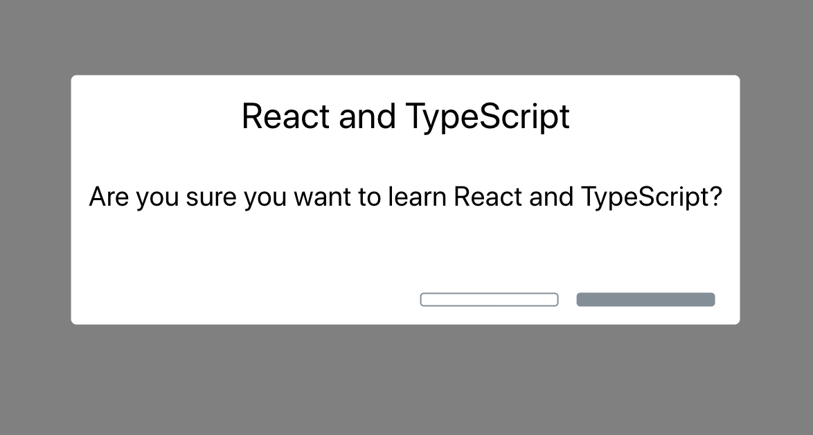
今天我们将要创建一个 Confirm 的对话框组件,类似alert对话框,有标题,内容,确认和取消按钮。组件完成后的效果如下图所示:
本篇文章主要包含以下内容:
- 使用 create-react-app 方式创建项目
- 创建第一个类组件
- JSX介绍
- 用 TS3 的方式定义组件属性
- 定义可选属性
- 初始化属性默认值
使用 create-react-app 方式创建项目
本示例我们将使用 create-react-app 创建项目,这篇文章《「 React TS3 专题」从创建第一个 React TypeScript3 项目开始》有介绍过,这里我们快速熟悉下。
1、创建项目
打开控制台,通过以下命令创建我们的 React TS3 项目:
npx create-react-app my-components --typescript
2、安装tslint依赖
接下来,为了保证项目代码质量,我们安装 tslint 的相关依赖:
cd my-components
npm install tslint tslint-react tslint-config-prettier --save-dev
3、然后添加 tslint.json 文件,配置相关规则
{
 "extends": ["tslint:recommended", "tslint-react", "tslint-config-prettier"],
 "rules": {
 "ordered-imports": false,
 "object-literal-sort-keys": false,
 "no-debugger": false,
 "no-console": false,
 },
 "linterOptions": {
 "exclude": [
 "config/**/*.js",
 "node_modules/**/*.ts",
 "coverage/lcov-report/*.js"
 ]
 }
}
4、运行项目
接下来安装相关依赖,并启动项目:
npm install
npm start
5、修改样式
打开 app.css 文件,我们进行一些样式调整其头部的高度,修改部分如下:
...
.App-logo {
 animation: App-logo-spin infinite 20s linear;
 height: 20vmin;
}
.App-header {
 background-color: #282c34;
 min-height: 40vh;
 display: flex;
 flex-direction: column;
 align-items: center;
 justify-content: center;
 font-size: calc(10px + 2vmin);
 color: white;
}
...
创建第一个类组件
1、创建 Confirm.tsx 文件
我们会在 src 目录下看到 App.tsx 文件,这是项目中为我们默认创建的组件,使用的是函数的方式创建组件,这里先不做介绍,接下来的文章会有介绍。我们先用类的声明方式创建一个单独的组件,在 src 目录创建一个 Confirm.tsx 文件。初始化的内容结构如下:
import * as React from "react";
class Confirm extends React.Component {
}
export default Confirm;
2、添加 render 方法
接下来我们添加 render 方法
...
class Confirm extends React.Component {
public render() {
 return (
 );
 }
}
...
3、实现 render 方法:
接下来我们实现上述的 render 方法,这里主要定义了组件的样式布局:
import * as React from "react";
class Confirm extends React.Component {
 public render() {
 return (
 <div className="confirm-wrapper confirm-visible">
 <div className="confirm-container">
 <div className="confirm-title-container">
 <span>This is where our title should go</span>
 </div>
 <div className="confirm-content-container">
 <p>This is where our content should go</p>
 </div>
 <div className="confirm-buttons-container">
 <button className="confirm-cancel">Cancel</button>
 <button className="confirm-ok">Okay</button>
 </div>
 </div>
 </div>
 );
 }
}
是不是觉得内容部分很像html, 在React里称JSX。作你会发现样式属性是 className 并不是我们熟悉的 class ,这是 JSX 语法所特有的。
4、 在 App.tsx 引入 Confirm 组件
import Confirm from "./Confirm";
...
<div className="App">
 <header className="App-header">
 ...
 </header>
<Confirm />
</div>
...
5、定义 Confirm.css 的样式
由于组件没有样式,还过于丑陋,接下来在 src 目录新建 Confirm.css 文件,我们来美化下我们的组件,代码如下:
.confirm-wrapper {
 position: fixed;
 left: 0;
 top: 0;
 width: 100%;
 height: 100%;
 background-color: gray;
 opacity: 0;
 visibility: hidden;
 transform: scale(1.1);
 transition: visibility 0s linear 0.25s, opacity 0.25s 0s, transform 0.25s;
 z-index: 1;
}
.confirm-visible {
 opacity: 1;
 visibility: visible;
 transform: scale(1);
 transition: visibility 0s linear 0s, opacity 0.25s 0s, transform 0.25s;
}
.confirm-container {
 background-color: #fff;
 position: absolute;
 top: 50%;
 left: 50%;
 transform: translate(-50%, -50%);
 border-radius: 0.2em;
 min-width: 300px;
}
.confirm-title-container {
 font-size: 1.3em;
 padding: 10px;
 border-top-left-radius: 0.2em;
 border-top-right-radius: 0.2em;
}
.confirm-content-container {
 padding: 0px 10px 15px 10px;
}
.confirm-buttons-container {
 padding: 5px 15px 10px 15px;
 text-align: right;
}
.confirm-buttons-container button {
 margin-left: 10px;
 min-width: 80px;
 line-height: 20px;
 border-style: solid;
 border-radius: 0.2em;
 padding: 3px 6px;
 cursor: pointer;
}
.confirm-cancel {
 background-color: #fff;
 border-color: #848e97;
}
.confirm-cancel:hover {
 border-color: #6c757d;
}
.confirm-ok {
 background-color: #848e97;
 border-color: #848e97;
 color: #fff;
}
.confirm-ok:hover {
 background-color: #6c757d;
 border-color: #6c757d;
}
然后在 Confirm.tsx 中引入 Confirm.css :
import"./Confirm.css";
6、启动应用
我们通过 npm start 启动我们的应用程序,效果如下:
JSX
上一小节,我们知道了JSX有点像HTML,允许我们在JavaScript代码(或TS3)中类似HTML一样进行使用,其实 React 使用 JSX 来替代常规的 JavaScript。
JSX 是一个看起来很像 XML 的 JavaScript 语法扩展。接下来我们来了解下在解释器的编译下最终会转换成什么。
1、使用 https://babeljs.io/repl 在线工具
使用这款在线工具,我们将类似的 类似 HTML 的 JSX 内容转换成 JavaScript 的语法结构,示例如下:
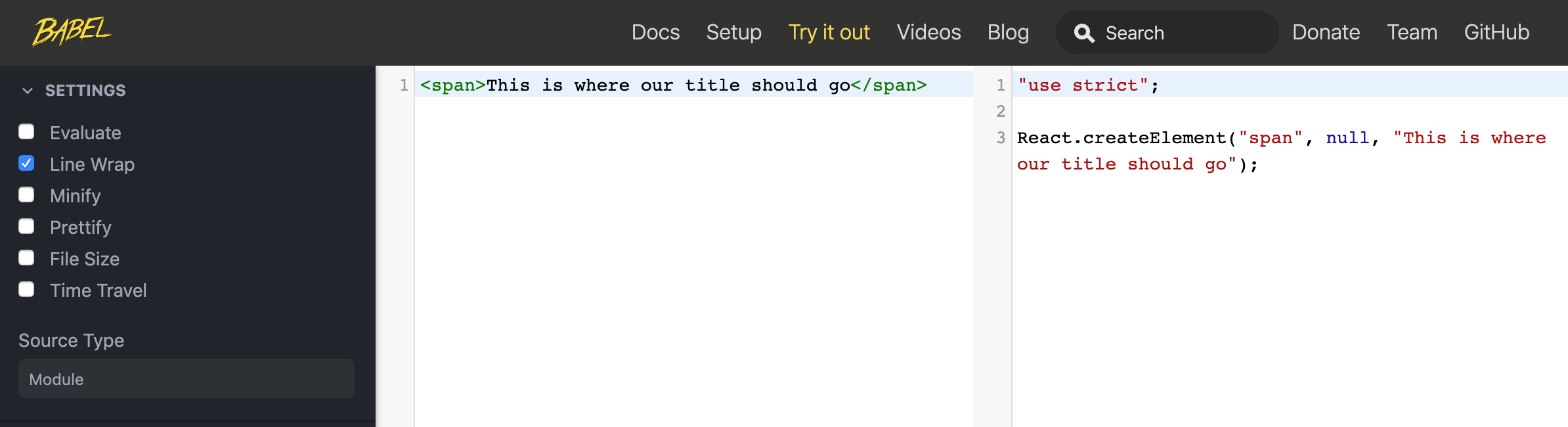
如上图所示我们可以看出,我们代码最终会转换成 React.createElement 方法进行声明,这个方法包含了三个参数标签属性(例如span,div等),第二就是标签相关的属性,比如可以是className,第三个参数就是子元素属性,用来进行标签嵌套的。
2、接下来在外层添加div
为了让结构更加复杂,我们在外层添加div, 代码如下:
<div className="confirm-title-container">
 <span>This is where our title should go</span>
</div>
使用在线工具进行转换,代码如下:
React.createElement(
 "div",
 { className: "confirm-title-container" },
 React.createElement(
 "span",
 null,
 "This is where our title should go"
 )
);
3、接下来定义属性
比如为组件自定义属性,结构如下:
const props = {
 title: "React and TypeScript"
};
<div className="confirm-title-container">
 <span>{props.title}</span>
</div>
使用在线工具进行转换,代码如下:
var props = {
 title: "React and TypeScript"
};
React.createElement(
 "div",
 { className: "confirm-title-container" },
 React.createElement(
 "span",
 null,
 props.title
 )
);
4、使用三元运算符,定义默认属性
const props = {};
<div className="confirm-title-container">
 <span>{props.title ? props.title : "React and TypeScript"}</span>
</div>
使用在线工具转换,代码如下:
var props = {};
React.createElement(
 "span",
 null,
 props.title ? props.title : "React and TypeScript"
)
JSX 就介绍到这里,我们清楚了类似HTML结构的JSX都会转换成javascript的原生结构,为什么不能使用class而使用className,笔者介绍到这里,你应该明白了吧,因为 class 是 javascript 的关键词 ES6的类声明部分。
用 TS3 的方式定义组件属性
组件的意义就是能够复用,上一小节,我们把组件的标题,内容固定写死了,接下来我们来看看在 TS3 项目里我们是如何使用组件属性的。
1、定义 TS3 类型属性接口
我们先来用 TS3 的方式定义接口类型,我们在 Confirm.tsx 文件里实现如下定义:
interface IProps {
 title: string;
 content: string;
}
2、接着将接口类型在类组件实现
通过添加到类的实现中,实现代码如下:
class Confirm extends React.Component<IProps>
有过TS基础的人,一眼就能看出 React.Component 是泛型类。泛型类规定了我们传入的接口的数据类型,可以灵活进行定义。
软件工程中,我们不仅要创建一致的定义良好的API,同时也要考虑可重用性。 组件不仅能够支持当前的数据类型,同时也能支持未来的数据类型,这在创建大型系统时为你提供了十分灵活的功能。 在像C#和Java这样的语言中,可以使用泛型来创建可重用的组件,一个组件可以支持多种类型的数据。 这样用户就可以以自己的数据类型来使用组件。
3、接下来定义组件的动态类型属性
我们将使用 this.props.propName 定义组件的动态属性,按照如下代码进行修改 Confirm.tsx 文件:
...
<div className="confirm-title-container">
 <span>{this.props.title}</span>
</div>
<div className="confirm-content-container">
 <p>{this.props.content}</p>
</div>
...
4、 Confirm.tsx 文件的最终代码
import * as React from "react";
import './Confirm.css';
interface IProps {
 title: string;
 content: string;
}
class Confirm extends React.Component<IProps> {
 public render() {
 return (
 <div className="confirm-wrapper confirm-visible">
 <div className="confirm-container">
 <div className="confirm-title-container">
 <span>{this.props.title}</span>
 </div>
 <div className="confirm-content-container">
 <p>{this.props.content}</p>
 </div>
 <div className="confirm-buttons-container">
 <button className="confirm-cancel">Cancel</button>
 <button className="confirm-ok">Okay</button>
 </div>
 </div>
 </div>
 );
 }
}
export default Confirm;
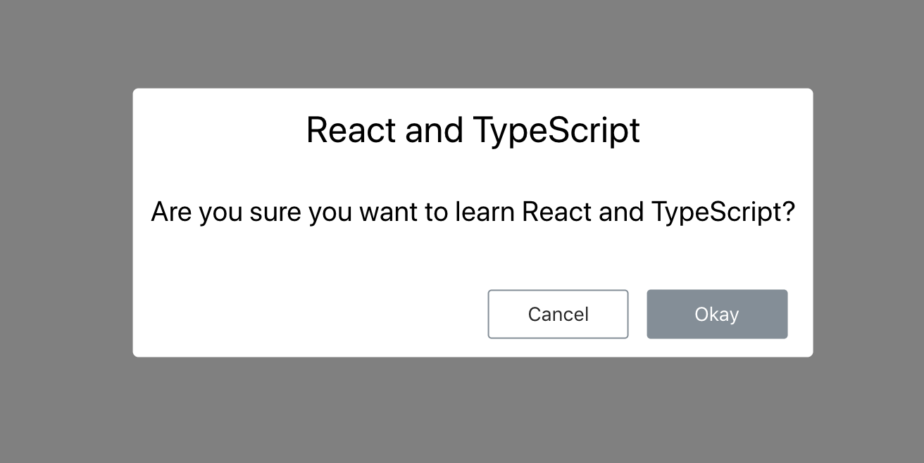
5、 接下来修改 App.tsx 文件
由于我们修改了 Confirm.tsx 文件,让属性接受动态传值,我们需要在 App.tsx 文件中定义属性内容,示例代码如下:
<Confirm
 title="React and TypeScript"
 content="Are you sure you want to learn React and TypeScript?"
/>
export default Confirm;
我们保存文件,你就会看到
定义可选属性
1、我们调用相关API时,有必传参数和可选参数。我们定义组件属性时,也可以这样,有些属性是必须填写,有的可不必。接着我们来定义确认按钮文字和否定按钮文字这些属性是可选的,我们来修改 Confirm.tsx 中的接口定义,示例如下:
interface IProps {
 title: string;
 content: string;
 cancelCaption?: string;
 okCaption?: string;
}
?: 的意思就是可选属性参数的意思,我们可以可以在调用组件时不用包含此属性
2、将可选属性在 Confirm.tsx 进行定义
<div className="confirm-buttons-container">
 <button className="confirm-cancel">
{this.props.cancelCaption}
 </button>
 <button className="confirm-ok">
{this.props.okCaption}
 </button>
</div>
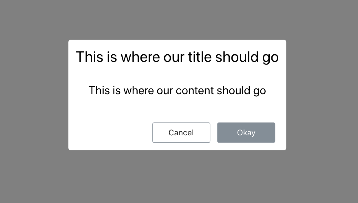
3、保存文件
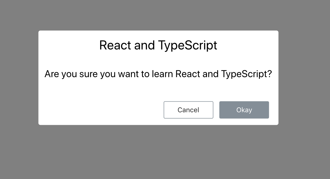
接下来为了验证可选属性会不会造成错误,暂时不在 App.tsx 文件中的 Confirm 组件调用中添加新属性,我们来保存 Confirm.tsx 文件,浏览器的效果如下:
没有报错,能正常运行,由于没有给按钮默认文字参数定义值,我们的按钮很难看,因为没有高度。接下来我们来给可选属性定义值。
初始化属性默认值
初始化组件时,我们可以给组件的属性定义默认值,这里就使用到了 defaultProps 静态对象属性。
1、声明静态对象属性
通过静态对象属性的方式,我们进行初始化可选参数的默认值,修改后的 Confirm.tsx 示例如下:
class Confirm extends React.Component<IProps> {
 public static defaultProps = {
 cancelCaption: "Cancel",
 okCaption: "Okay"
 };
 public render() { ... }
}
保存 Confirm.tsx 文件,我们就会看到浏览器的变化:
2、修改默认属性的值
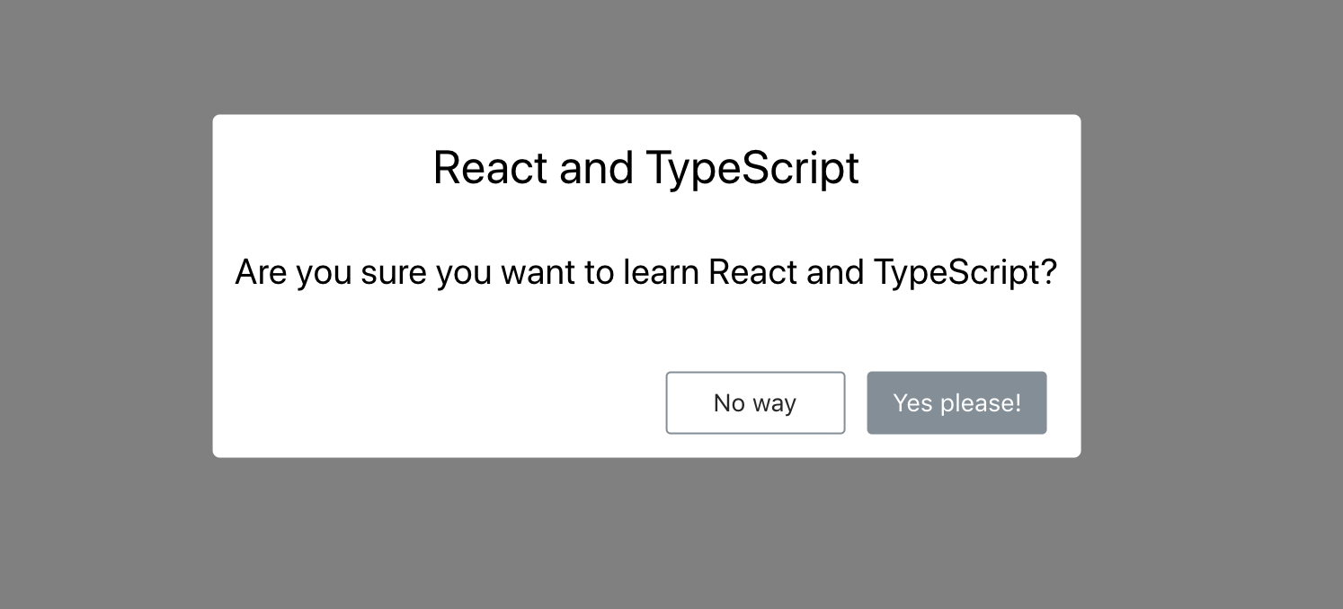
如果你想修改默认属性的值,我们可以修改 App.tsx 文件,添加可选属性即可:
<Confirm
 title="React and TypeScript"
 content="Are you sure you want to learn React and TypeScript?"
 cancelCaption="No way"
 okCaption="Yes please!"
/>
保存 App.tsx 文件,你就会看到浏览器会刷新变化,效果如下图:

具有默认值的可选属性的组件更易于使用,让我们的组件更加灵活。
小节
今天的章节就分享到这里,我们一起学习了如何使用 TS3 的方式创建组件,定义属性和其属性的默认值,接下来的文章里,笔者将给大家介绍如何用 TS3 的方式定义组件事件。
更多精彩内容,请微信关注“前端达人”公众号!