

前言
Flutter是谷歌的移动UI框架,可以快速在iOS和Android上构建高质量的原生用户界面。
IT界著名的尼古拉斯·高尔包曾说:轮子是IT进步的阶梯!热门的框架千篇一律,好用轮子万里挑一!Flutter作为这两年开始崛起的跨平台开发框架,其第三方生态相比其他成熟框架还略有不足,但轮子的数量也已经很多了。本系列文章挑选日常app开发常用的轮子分享出来,给大家提高搬砖效率,同时也希望flutter的生态越来越完善,轮子越来越多。
本系列文章准备了超过50个轮子推荐,工作原因,尽量每1-2天出一篇文章。
tip:本系列文章合适已有部分flutter基础的开发者,入门请戳:flutter官网
正文
轮子
- 轮子名称:percent_indicator
- 轮子概述:flutter一个圆形和线形的进度条.
- 轮子作者:diego.velasquez.lopez@gmail.com
- 推荐指数:★★★★
- 常用指数:★★★
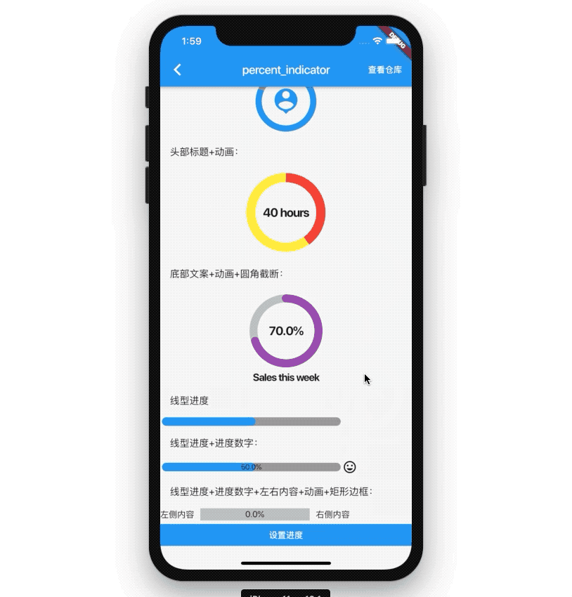
- 效果预览:
功能概述
- 圆形百分比进度
- 线形百分比进度
- 切换动画
- 自定义动画的持续时间
- 基于百分比值的进度
- 进度和背景色
- 自定义大小
- 左,右或居中子项用于线性百分比指示器
- 圆形百分比指示器的顶部,底部或中心widget
- 使用渐变色
安装
dependencies:
  percent_indicator: ^2.1.1+1
import 'package:percent_indicator/percent_indicator.dart';
使用
圆形进度
基础使用
new CircularPercentIndicator(
    radius: 60.0, //大小
    lineWidth: 5.0,//指示线条大小
    percent: 1.0,//当前进度
    center: new Text("100%"),//中心widget 可以是文字 或其他widget 如何icon
    progressColor: Colors.green, //进度条颜色
    ....
)
头部标题+icon内容+背景色:
```dart
new CircularPercentIndicator(
    radius: 100.0,
    lineWidth: 10.0,
    percent: 0.8,
    header: new Text("Icon header"),
    center: new Icon(
        Icons.person_pin,
        size: 50.0,
        color: Colors.blue,
    ),
    backgroundColor: Colors.grey,
    progressColor: Colors.blue,
)
头部标题+动画:
new CircularPercentIndicator(
    radius: 130.0,
    animation: true,
    animationDuration: 1200,
    lineWidth: 15.0,
    percent: 0.4,
    center: new Text("40 hours",style:new TextStyle(fontWeight: FontWeight.bold, fontSize: 20.0),),
    circularStrokeCap: CircularStrokeCap.butt,
    backgroundColor: Colors.yellow,
    progressColor: Colors.red,
),
底部文案+动画+圆角截断:
new CircularPercentIndicator(
    radius: 120.0,
    lineWidth: 13.0,
    animation: true,
    percent: 0.7,
    center: new Text(
    "70.0%",
    style:
        new TextStyle(fontWeight: FontWeight.bold, fontSize: 20.0),
    ),
    footer: new Text(
    "Sales this week",
    style:
        new TextStyle(fontWeight: FontWeight.bold, fontSize: 17.0),
    ),
    circularStrokeCap: CircularStrokeCap.round,
    progressColor: Colors.purple,
)
线型进度
基础使用:
new LinearPercentIndicator(
    width: 300,
    lineHeight: 14.0,
    percent: 0.5,
    backgroundColor: Colors.grey,
    progressColor: Colors.blue,
),
线型进度+进度数字:
new LinearPercentIndicator(
    width: 300,
    lineHeight: 14.0,
    percent: 0.5,
    center: Text(
    "50.0%",
    style: new TextStyle(fontSize: 12.0),
    ),
    trailing: Icon(Icons.mood),
    linearStrokeCap: LinearStrokeCap.roundAll,
    backgroundColor: Colors.grey,
    progressColor: Colors.blue,
)
线型进度+进度数字+左右内容+动画+矩形边框:
new LinearPercentIndicator(
    width: 200,
    animation: true,
    animationDuration: 1000,
    lineHeight: 20.0,
    leading: new Text("左侧内容"),
    trailing: new Text("右侧内容"),
    percent: percent,
    center: Text((percent*100).toString()+'%'),
    linearStrokeCap: LinearStrokeCap.butt,
    progressColor: Colors.red,
)
更多用法可自行参考轮子文档中的参数定制。
结尾
- 轮子仓库地址:pub.flutter-io.cn/packages/pe…
- 系列演示demo源码:github.com/826327700/f…
