


背景
最近看了 Chrome Dev Summit 2019 大会视频, 了解到了很多之前不知道的 CSS 新特性,挺有意思的。
下面我就介绍几个激动人心的特性。
正文
特性总览:
- Sticky
- Stickey Stack
- Sticy Slide
- Sticky Desperado
- Focus-within
- prefers-reduced-motion
- Scroll Snap
- Scroll Snap Horizontal
- Scroll Snap Vertical
- Scroll Snap Matrix
- Backdrop-filter
- Gap
- Paint API
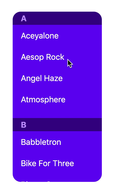
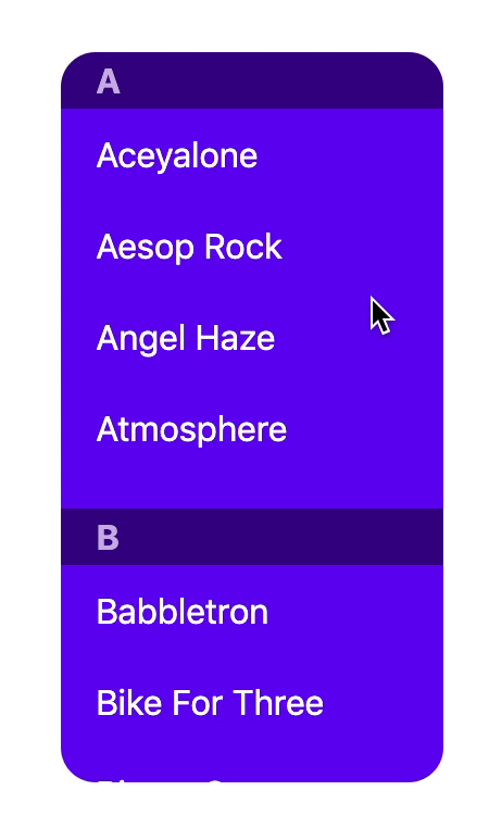
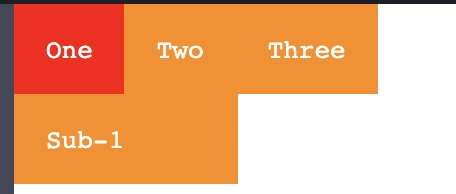
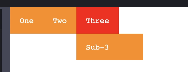
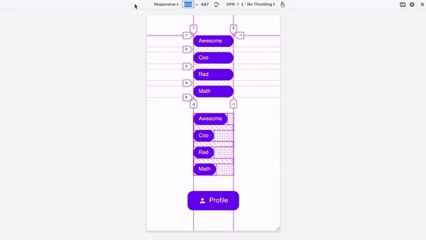
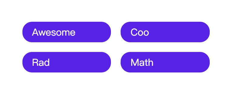
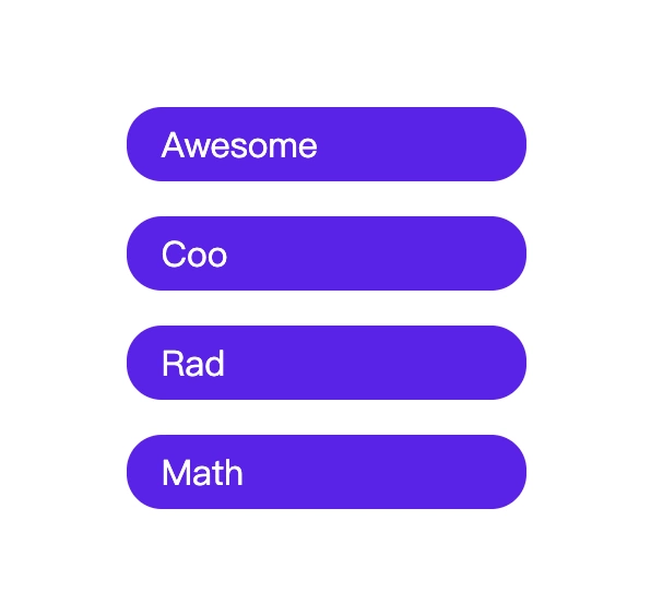
1. Stickey Stack
stickey 属性我们或许都听说过,常见于吸顶需求。
官方描述:
The position CSS property
sets how an element is positioned in a document.Thetop, right, bottom, and leftpropertiesdeterminethe final location of positioned elements.
官方示例:
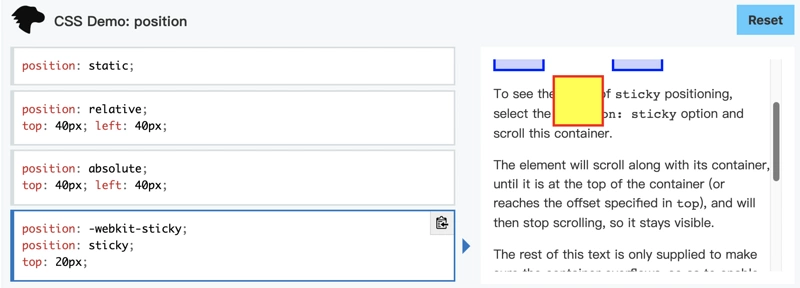
当我们滚动容器的时候, stickey 的元素会脱离文档流, 如上图所示。
利用这个属性, 我们可以轻松应对日常中的吸顶需求:
示意图:
核心属性:
 position: sticky;
 top: 0;
完整示例代码:
// html
dl.sticky-stack
  dt A
  dd Aceyalone
  dd Aesop Rock
  dd Angel Haze
  dd Atmosphere

  dt B
  dd Babbletron
  dd Bike For Three
  dd Binary Star
  dd Blackalicious
  dd Black Sheep
  dd Blueprint
  dd Blue Scholars

  dt C
  dd Cecil Otter
  dd Chali 2na
  dd Chance The Rapper
  dd Common Market
  dd Cool Calm Pete
  dd Czarface

  dt D
  dd Danger Doom
  dd Darc Mind
  dd Dem Atlas
  dd Dessa

//css

@use postcss-nested;

.sticky-stack {
  background: hsl(265 100% 47%);
  color: white;
  margin: 0;

  height: 80vh;
  max-height: 40ex;
  border-radius: 1rem;
  overflow-y: auto;

  & dt {
    position: sticky;
    top: 0;

    font-weight: bold;
    background: hsl(265 100% 27%);
    color: hsl(265 100% 80%);
    padding: .25rem 1rem;
  }

  & dd {
    margin: 0;
    padding: .75rem 1rem;

    & + dt {
      margin-top: 1rem;
    }
  }
}

body {
  display: grid;
  place-items: center;
  min-height: 100vh;
  font-family: system-ui;
}
切换不同的属性值, 可以实现不同的吸顶效果:
比如: Sticky Slide
Sticky Slide
在线demo :
Sticky Desperado
在线demo: codepen.io/argyleink/p…
官方文档: developer.mozilla.org/en-US/docs/…
2. Focus-within
这也是一个很有趣的特性, 适用于一个元素本身,或者其后代元素接收到 focus 事件的时候。
举个例子:
<form>
  <label for="given_name">Given Name:</label>
  <input id="given_name" type="text">
</form>


// css
form {
  border: 1px solid;
  color: gray;
  padding: 4px;
}

form:focus-within {
  background: yellow;
  color: black;
}

form:focus-within  input{
  color: red;
}
当我们focus到 input 里, 打两个字的时候:
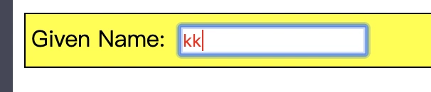
这在以前, 是需要借助js 控制class 为其其祖先节点 添加样式, 现在通过 :focus-within 就可以实现了,美滋滋。
借助这个特性, 我们可以实现一个简单的tab 页面切换:
在线demo地址:
3. prefers-reduced-motion
The prefers-reduced-motion CSS media feature is used to
detect if the user has requested that the system minimize the amount of animation or motion it uses.
即: 这个特性用来检测用户是否要最小化动画。
示例 demo:
<div class="animation">animated box</div>

.animation {
  animation: vibrate 0.3s linear infinite both;
}

@media (prefers-reduced-motion: reduce) {
  .animation {
    animation: none;
  }
}
官方示例:developer.mozilla.org/en-US/docs/…
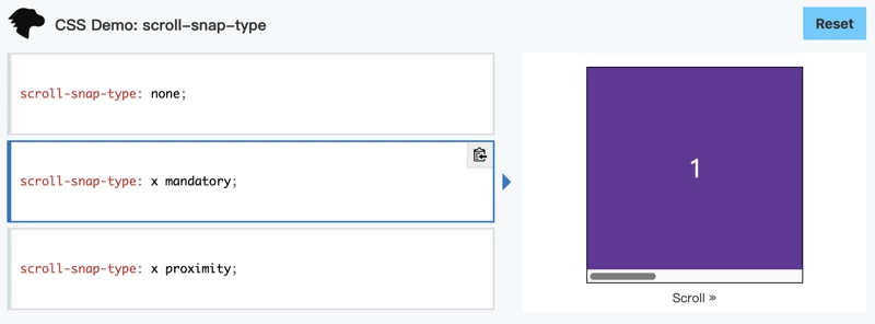
4. Scroll Snap
这是一个非常有意思的特性。
以往, 在一个滑动列表中, 我们总是希望在滑动结束之后, 能看到一个完整的子项。
比如一横列的图片滑动之后,看到的刚好是一个在视区中的完整图像, 这个可以使用 js 处理滑动事件, 动态计算X坐标来实现。
现在CSS也支持了, 这个特性就是Scroll Snap.
这个属性, 有三种表现形式:
1. Scroll Snap Horizontal 横向滚动
2. Scroll Snap Vertical 纵向滚动
3. Scroll Snap Matrix 双向滚动
以第一个 Scroll Snap Horizontal 横向滚动 为例:
示意图:
官方示例:
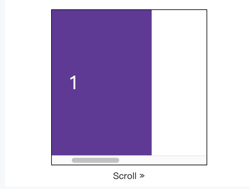
滑动到这里, 送开之后, 回弹到完整的1:
示例代码:
// html
<div class="container x mandatory-scroll-snapping" dir="ltr">
  <div>X Mand. LTR</div>
  <div>2</div>
  <div>3</div>
  <div>4</div>
  <div>5</div>
</div>

//css
.container {
  display: flex;
  overflow: auto;
  outline: 1px dashed lightgray;
  flex: none;
}

.container.x {
  width: 100%;
  height: 128px;
  flex-flow: row nowrap;
}

/* scroll-snap */
.x.mandatory-scroll-snapping {
  scroll-snap-type: x mandatory;
}
在线体验地址: developer.mozilla.org/en-US/docs/…
另外两个分别是纵向滚动, 还有双向滚动, 就不多说了, 可以在官方示例中体验。
5. Backdrop-filter
这个特性还处于实验阶段。
正如属性名称描述的那样, 这个特性, 会给某个元素的后面应用图形效果, 比如模糊, 或者颜色转换。
因为是应用到元素后方, 所以要保证这个元素, 或者他的背景, 至少部分是透明的。
示例:
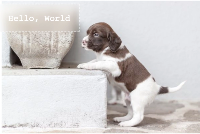
代码:
// html

<main>
  <h1>Hello, World</h1>
  <img src="http://place-puppy.com/600x400" alt="">
</main>

// css
h1 {
  position: absolute;
  top: 0;
  left: 0;
  border: 2px dashed;
  padding: 1em;
  backdrop-filter: blur(10px);
  color: white;
  font-family: monospace;
  font-weight: 100;
}
官方文档:
developer.mozilla.org/en-US/docs/…
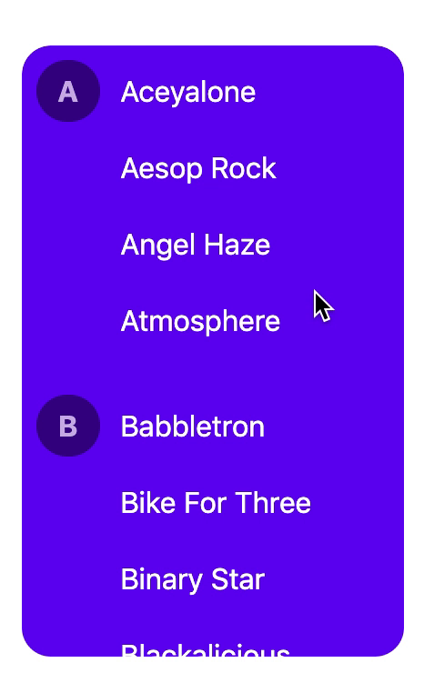
6. Gap
gap 允许我们在行列之间直观的设置间距, 它是 row-gap 和 column-gap 的简写形式。
以往我们做列表的时候, 要控制元素到其他元素的间距, 往往使用的是margin, 利用的是外边距重叠的特性,这就是图中的 extra spacing, 而现在有了gap, 我们就有了更优雅的解决办法:
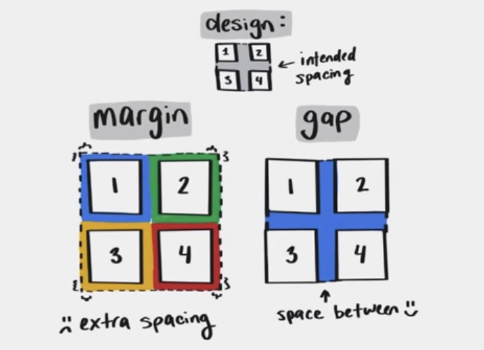
看两个示意图:
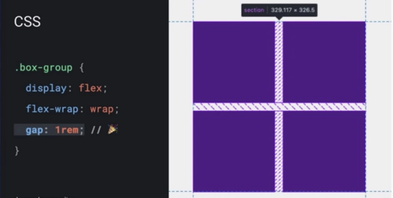
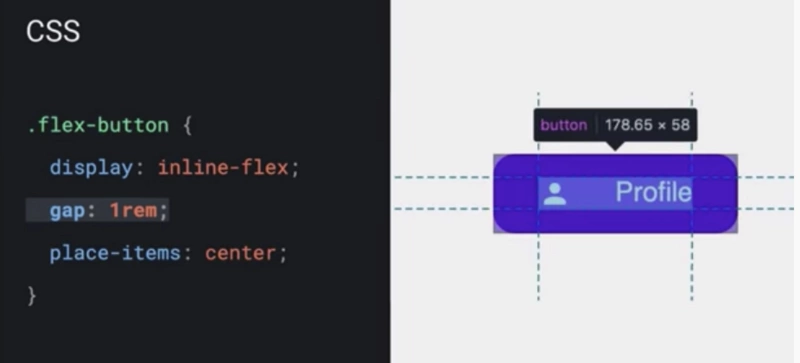
这种方式, 无论是单列, 还是多列。 都有十分良好的表现:
在线demo: codepen.io/argyleink/p…
官方文档: developer.mozilla.org/en-US/docs/…
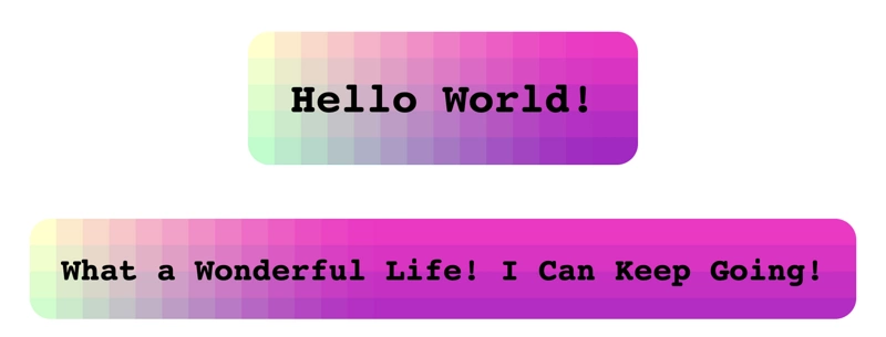
7. Paint API
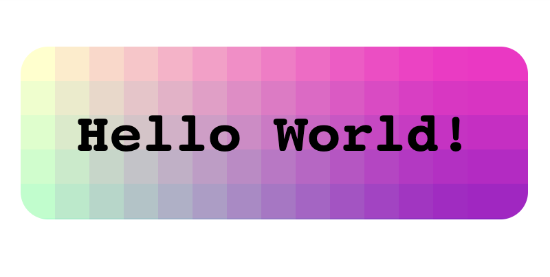
Paint Api 提供了一种更加接近浏览器底层的绘制机制,目前这个 Api 还处在Level 1 阶段。
看个demo:
// html
<script>
  if ('paintWorklet' in CSS) {
    // load this CodePen's JS file as the paint worklet
    CSS.paintWorklet.addModule('/una/pen/RMVjaQ.js');
  } else {
    document.querySelector('html').classList.add('no-support');
  }
</script>

<h1 class="speech">Hello World!</h1>
<h2 class="speech">What a Wonderful Life! I Can Keep Going!</h2>

// css
*, *::before, *::after {
  box-sizing: border-box;
}

body {
  font-size: 20px;
  font-family: monospace;
  text-align: center;
}

.speech{
  background-image: paint(rainbowtize);
  padding: 1em;
  display: inline-block;
  border-radius: 20px;
}
在线demo: codepen.io/una/pen/VXz…
以上几个特性,都非常有意思, 简单的介绍给大家, 希望能给大家带来一些启发。
短短几个特性, 昨晚看了视频, 今天用了一个下午整理资料, 动图,非常的耗时间。
如果内容对你有所启发, 还请 给个赞 鼓励一下。
谢谢大家。
结尾
附大会视频链接:
最后
如果觉得内容有帮助可以关注下我的公众号 「 前端e进阶 」,一起学习, 一起成长!

