

上篇讲解了
按钮组件的开发过程。
接下来的主角是另一个很常见的组件:分割线
使用场景
顾名思义,为了达到更好的阅读效果,合理地对内容进行分割,这就是分割线。我们来看下今天要开发的几种分割线的实际效果:
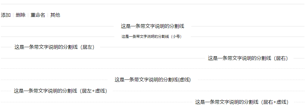
大体就是:
- 普通分割线
- 垂直分割线
- 文字分割线
- 虚线分割线
- 以及以上分割线的组合使用
定义props
看看我们定义了哪些props来完成以上的几个功能:
props: {
    // 水平或者垂直
    type: {
      type: String,
      default: "horizontal"
    },
    // 文字对齐(居左、居中、居右)
    orientation: {
      type: String,
      default: "center"
    },
    // 虚线
    dashed: {
      type: Boolean,
      default: false
    },
    // 大小
    size: {
      type: String,
      default: "default"
    }
  }
Template
Template描述的是组件的外形结构,本组件可以分为三层,分别是:最外层的div、中间层的span、以及文字的slot
<template>
  <div :class="classes">
    <span v-if="hasSlot" :class="slotClasses">
      <slot />
    </span>
  </div>
</template>
CSS类的计算
通过整合传入的props,为Template应用上相关的class,所以这部分都在computed中实现:
computed: {
    // 判断是否传入文字
    hasSlot() {
      return !!this.$slots.default;
    },
    // 外层div的class
    classes() {
      return [
        `${prefixCls}`,
        `${prefixCls}-${this.type}`,
        ...
      ];
    },
    // 中间层span的class
    slotClasses() {
      return [`${prefixCls}-inner-text`];
    }
}
重头戏:CSS
首先看下水平或者垂直是怎么控制的:
.@{divider-prefix-cls} {
    background: @border-color-split;
    &-vertical{
        display: inline-block;
        margin: 0 8px;
        height: 0.9em;
        width: 1px;
        vertical-align: middle;
        position: relative;
        top: -0.06em;
    }
    &-horizontal {
        display: block;
        height: 1px;
        width: 100%;
        min-width: 100%;
        margin: 24px 0;
        clear: both;
    }
}
带有文字
.@{divider-prefix-cls} {
    background: @border-color-split;
    ...
    &-horizontal&-with-text-center,
    &-horizontal&-with-text-left,
    &-horizontal&-with-text-right {
        display: table;
        white-space: nowrap;
        text-align: center;
        background: transparent;
        margin: 16px 0;
        font-size: 16px;
        &:before,
        &:after{
            content: '';
            display: table-cell;
            position: relative;
            top: 50%;
            width: 50%;
            border-top: 1px solid @border-color-split;
            transform: translateY(50%);
        }
    }
    ...
控制文本对齐
    // ...
    &-horizontal&-with-text-left {
        &:before {
            top: 50%;
            width: 5%;
        }
        &:after {
            top: 50%;
            width: 95%;
        }
    }

    &-horizontal&-with-text-right {
        &:before {
            top: 50%;
            width: 95%;
        }
        &:after {
            top: 50%;
            width: 5%;
        }
    }
    // ...
CSS这块的代码不是很好讲解,虽然用到的都是平时常见的属性,但是能提炼到如此简洁的地步,并不是那么容易,建议大家完整地看下CSS部分的代码divider.less
更多源码
以整个的代码结构和思想来自ViewUI,真心觉得ViewUI的代码比ElementUI的容易阅读和学习(个人观点)
