


老孟导读:Flutter中很多组件都有一个叫做
shape的属性,类型是ShapeBorder,比如Button类、Card等组件,shape表示控件的形状,系统已经为我们提供了很多形状,对于没有此属性的组件,可以使用 Clip 类组件进行裁减。
BeveledRectangleBorder
斜角矩形边框,用法如下:
RaisedButton(
  shape: BeveledRectangleBorder(
      side: BorderSide(width: 1, color: Colors.red),
      borderRadius: BorderRadius.circular(10)),
  child: Text('老孟'),
  onPressed: () {},
)

如果设置的半径比控件还大,就会变成菱形:
 3RaisedButton(
  shape: BeveledRectangleBorder(
      side: BorderSide(width: 1, color: Colors.red),
      borderRadius: BorderRadius.circular(100)),
  child: Text('老孟'),
  onPressed: () {},
)

同理,如果半径设置为0,就是矩形。
RaisedButton(
  shape: BeveledRectangleBorder(
      side: BorderSide(width: 1, color: Colors.red),
      borderRadius: BorderRadius.circular(0)),
  child: Text('老孟'),
  onPressed: () {},
)

Border
Border允许单独设置每一个边上的线条样式.
RaisedButton(
  shape: Border(
    top: BorderSide(color: Colors.red,width: 2)
  ),
  child: Text('老孟'),
  onPressed: () {},
)

设置全部
RaisedButton(
        shape: Border(
          top: BorderSide(color: Colors.red,width: 10),
          right: BorderSide(color: Colors.blue,width: 10),
          bottom: BorderSide(color: Colors.yellow,width: 10),
          left: BorderSide(color: Colors.green,width: 10),
        ),
        child: Text('老孟'),
        onPressed: () {},
      )

BorderDirectional
BorderDirectional和Border基本一样,区别就是BorderDirectional带有阅读方向,大部分国家阅读是从左到右,但有的国家是从右到左的,比如阿拉伯等。
RaisedButton(
  shape: BorderDirectional(
    start: BorderSide(color: Colors.red,width: 2),
    end: BorderSide(color: Colors.blue,width: 2),
  ),
  child: Text('老孟'),
  onPressed: () {},
)

CircleBorder
圆形
RaisedButton(
  shape: CircleBorder(side: BorderSide(color: Colors.red)),
  child: Text('老孟'),
  onPressed: () {},
)

ContinuousRectangleBorder
连续的圆角矩形,直线和圆角平滑连续的过渡,和RoundedRectangleBorder相比,圆角效果会小一些。
RaisedButton(
  shape: ContinuousRectangleBorder(
      side: BorderSide(color: Colors.red),
      borderRadius: BorderRadius.circular(20)),
  child: Text('老孟'),
  onPressed: () {},
)

RoundedRectangleBorder
圆角矩形
RaisedButton(
  shape: RoundedRectangleBorder(
      side: BorderSide(color: Colors.red),
      borderRadius: BorderRadius.circular(10)),
  child: Text('老孟'),
  onPressed: () {},
)

StadiumBorder
类似足球场的形状,两边圆形,中间矩形
RaisedButton(
  shape: StadiumBorder(
      side: BorderSide(color: Colors.red),),
  child: Text('老孟'),
  onPressed: () {},
)

OutlineInputBorder
带外边框
RaisedButton(
  shape: OutlineInputBorder(
    borderSide: BorderSide(color: Colors.red),
    borderRadius: BorderRadius.circular(10),
  ),
  child: Text('老孟'),
  onPressed: () {},
)

UnderlineInputBorder
下划线边框
RaisedButton(
  shape: UnderlineInputBorder(
    borderSide: BorderSide(color: Colors.red),
  ),
  child: Text('老孟'),
  onPressed: () {},
)

ClipRect
ClipRect组件使用矩形裁剪子组件,通常情况下,ClipRect作用于CustomPaint 、 CustomSingleChildLayout 、 CustomMultiChildLayout 、 Align 、 Center 、 OverflowBox 、 SizedOverflowBox组件,例如ClipRect作用于Align,可以仅显示上半部分,代码如下:
ClipRect(
  child: Align(
    alignment: Alignment.topCenter,
    heightFactor: 0.5,
    child: Container(
      height: 150,
      width: 150,
      child: Image.asset(
        'images/1.png',
        fit: BoxFit.cover,
      ),
    ),
  ),
)
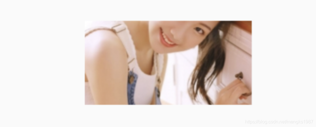
全图效果:

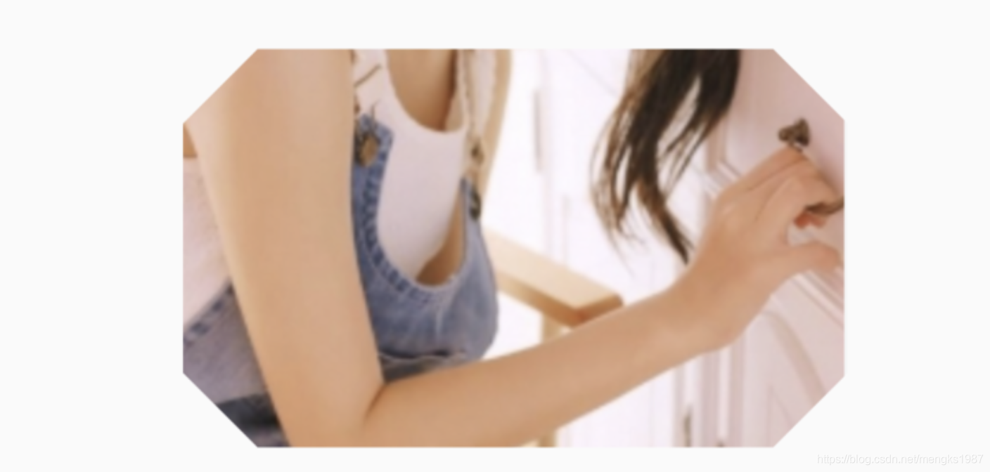
裁剪效果:
clipper参数定义裁剪规则,下面具体介绍。
clipBehavior参数定义了裁剪的方式,只有子控件超出父控件的范围才有裁剪的说法,各个方式说明如下:
- none:不裁剪,系统默认值,如果子组件不超出边界,此值没有任何性能消耗。
- hardEdge:裁剪但不应用抗锯齿,速度比
none慢一点,但比其他方式快。 - antiAlias:裁剪而且抗锯齿,此方式看起来更平滑,比
antiAliasWithSaveLayer快,比hardEdge慢,通常用于处理圆形和弧形裁剪。 - antiAliasWithSaveLayer:裁剪、抗锯齿而且有一个缓冲区,此方式很慢,用到的情况比较少。
ClipRRect
ClipRRect组件可以对子组件进行圆角裁剪,默认圆角半径为0,注意ClipRRect有2个R,不是上面介绍的ClipRect。
用法如下:
ClipRRect(
  borderRadius: BorderRadius.circular(20),
  child: Container(
    height: 150,
    width: 150,
    child: Image.asset(
      'images/1.png',
      fit: BoxFit.cover,
    ),
  ),
)
效果如图:

ClipOval
ClipOval裁剪为椭圆形,椭圆形的大小为正切父组件,因此如果父组件为正方形,切出来是圆形,用法如下:
ClipOval(
  child: Container(
    height: 150,
    width: 250,
    child: Image.asset(
      'images/1.png',
      fit: BoxFit.cover,
    ),
  ),
)
效果如下:

ClipPath
ClipPath组件根据路径进行裁剪,我们自定义裁剪路径也可以使用系统提供的,用法如下:
ClipPath.shape(
  shape: StadiumBorder(),
  child: Container(
    height: 150,
    width: 250,
    child: Image.asset(
      'images/1.png',
      fit: BoxFit.cover,
    ),
  ),
)
shape参数是ShapeBorder类型,系统已经定义了很多形状,介绍如下:
-
RoundedRectangleBorder:圆角矩形
-
ContinuousRectangleBorder:直线和圆角平滑连续的过渡,和RoundedRectangleBorder相比,圆角效果会小一些。
-
StadiumBorder:类似于足球场的形状,两端半圆。
-
BeveledRectangleBorder:斜角矩形。效果如图:
-
CircleBorder:圆形。
CustomClipper
CustomClipper并不是一个组件,而是一个abstract(抽象)类,使用CustomClipper可以绘制出任何我们想要的形状,比如三角形,代码如下:
@override
Widget build(BuildContext context) {
  return Center(
    child: ClipPath(
      clipper: TrianglePath(),
      child: Container(
        height: 150,
        width: 250,
        child: Image.asset(
          'images/1.png',
          fit: BoxFit.cover,
        ),
      ),
    ),
  );
}
自定义TrianglePath代码如下:
class TrianglePath extends CustomClipper<Path>{
  @override
  Path getClip(Size size) {
    var path = Path();
    path.moveTo(size.width/2, 0);
    path.lineTo(0, size.height);
    path.lineTo(size.width, size.height);
    return path;
  }

  @override
  bool shouldReclip(CustomClipper<Path> oldClipper) {
    return true;
  }
}
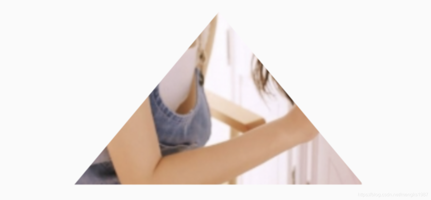
效果如下:
我们还可以绘制五角星,代码如下:
class StarPath extends CustomClipper<Path> {
  StarPath({this.scale = 2.5});

  final double scale;

  double perDegree = 36;

  /// 角度转弧度公式
  double degree2Radian(double degree) {
    return (pi * degree / 180);
  }

  @override
  Path getClip(Size size) {
    var R = min(size.width / 2, size.height / 2);
    var r = R / scale;
    var x = size.width / 2;
    var y = size.height / 2;

    var path = Path();
    path.moveTo(x, y - R);
    path.lineTo(x - sin(degree2Radian(perDegree)) * r,
        y - cos(degree2Radian(perDegree)) * r);
    path.lineTo(x - sin(degree2Radian(perDegree * 2)) * R,
        y - cos(degree2Radian(perDegree * 2)) * R);
    path.lineTo(x - sin(degree2Radian(perDegree * 3)) * r,
        y - cos(degree2Radian(perDegree * 3)) * r);
    path.lineTo(x - sin(degree2Radian(perDegree * 4)) * R,
        y - cos(degree2Radian(perDegree * 4)) * R);
    path.lineTo(x - sin(degree2Radian(perDegree * 5)) * r,
        y - cos(degree2Radian(perDegree * 5)) * r);
    path.lineTo(x - sin(degree2Radian(perDegree * 6)) * R,
        y - cos(degree2Radian(perDegree * 6)) * R);
    path.lineTo(x - sin(degree2Radian(perDegree * 7)) * r,
        y - cos(degree2Radian(perDegree * 7)) * r);
    path.lineTo(x - sin(degree2Radian(perDegree * 8)) * R,
        y - cos(degree2Radian(perDegree * 8)) * R);
    path.lineTo(x - sin(degree2Radian(perDegree * 9)) * r,
        y - cos(degree2Radian(perDegree * 9)) * r);
    path.lineTo(x - sin(degree2Radian(perDegree * 10)) * R,
        y - cos(degree2Radian(perDegree * 10)) * R);
    return path;
  }

  @override
  bool shouldReclip(StarPath oldClipper) {
    return oldClipper.scale != this.scale;
  }
}
scale参数表示间隔的点到圆心的缩放比例,五角星效果如下:

下面用动画动态设置scale,代码如下:
class StartClip extends StatefulWidget {
  @override
  State<StatefulWidget> createState() => _StartClipState();
}

class _StartClipState extends State<StartClip>
    with SingleTickerProviderStateMixin {
  AnimationController _controller;
  Animation _animation;

  @override
  void initState() {
    _controller =
        AnimationController(duration: Duration(seconds: 2), vsync: this)
          ..addStatusListener((status) {
            if (status == AnimationStatus.completed) {
              _controller.reverse();
            } else if (status == AnimationStatus.dismissed) {
              _controller.forward();
            }
          });
    _animation = Tween(begin: 1.0, end: 4.0).animate(_controller);
    _controller.forward();
    super.initState();
  }

  @override
  Widget build(BuildContext context) {
    return Center(
      child: AnimatedBuilder(
          animation: _animation,
          builder: (context, child) {
            return ClipPath(
              clipper: StarPath(scale: _animation.value),
              child: Container(
                height: 150,
                width: 150,
                color: Colors.red,
              ),
            );
          }),
    );
  }
}
效果如下:

交流
老孟Flutter博客地址(330个控件用法):laomengit.com
欢迎加入Flutter交流群(微信:laomengit)、关注公众号【老孟Flutter】:
